From TV series ‘Sons of Anarchy’ to originations all around Australia, the popular choice of décor for boardroom seems to be predominately shades of deep brown and black.

This color scheme alludes itself to projecting power, as best described by Ron Burgundy in the movie Anchorman. ” I’m very important. I have many leather-bound books and my apartment smells of rich mahogany.”
This is the room where the most important decisions are made, and also the room with the least women. Out of the 500 of the largest companies listed on the Australian Securities Exchange (ASX), women make up only 17.1% of board positions. From the companies on that list, 162 boards are still without any women. There are just 11 female CEOs on the ASX 200, and 41 of the nation’s largest companies don’t have a woman on their executive leadership.
What does this all have to do with the color schemes, you may ask? While there’s no official research pointing to this, here are some of my thoughts.
Last week, DCC* co-founder Gemma Lloyd and I were visiting an ASX-listed client, and while waiting in the lobby, I found myself looking at what to me looked like a very masculine board room. It reminded me of the White House Situation Room as portrayed in movies with high backed chairs, rich mahogany furniture and an overall, very serious and somewhat intimidating feel.
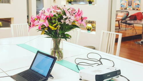
I like to think of myself as a fairly confident woman, comfortable in most environments around all kinds of people. But as I imagined being the only woman in that room, somehow, the thought was quite scary. I contemplated if I’d feel the same in a room that looked like this:

The above photo was taken at One Roof Women, a co-working space for female entrepreneurs. It’s definitely gorgeous and on the other end of the scale, positioned on the feminine side, which leads to the question- “What does a gender neutral boardroom look like?”
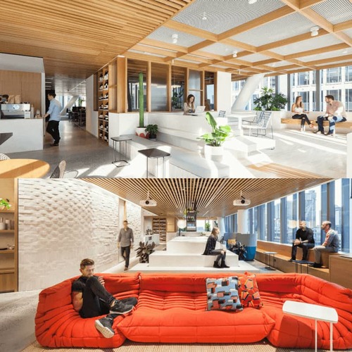
These days, many companies are pushing the envelope when it comes to getting the most from their staff by creating environments which foster collaboration, creativity and innovation. “Work is what you do, not where you do it,” rings true, but there’s no denying that “where” you do it can be engineered to either feel cold and generic (hello office cubicles) or welcoming and inclusive. We’ve visited a number of remarkable offices lately, here are a few of our favorites.
Dropbox who have recently moved into a new office in Sydney and have created a beautiful, warm atmosphere, mirroring their commitment to a workplace where everyone feels like they belong.
“It’s up to all of us at Dropbox to create a truly diverse team and culture and our new office space will help attract more diverse candidates. At Dropbox, we think diversity serves another purpose. Diversity makes work more enjoyable, and makes it easier for people to be themselves. Because of this belief we wanted to bring the idea of home and the spirit of family into our new space in Sydney. The vision was to create not just an office to work in every day, not just a ‘house’ for staff, but a place for shared experience, for making memories and for storytelling, a veritable home for the Dropbox family.” Deeps De Silva, Head of Marketing APAC, Dropbox
NAB, who have designed their building in Docklands, Melbourne to drive collaboration and encourage flexible working. When showing me around, Nina Pollard, Talent Acquisition Manager, Personal Banking at NAB shared her thoughts on the space,
“The best thing about this layout, is that it’s impossible to tell what time people come and go,” she explained. “There’s no cubicles with someone peeking over and keeping tabs on when you are there and when you aren’t. It’s a trust based approach that encourages people to act responsibly and ‘do the right thing’ – a core value of the company.”

When relocating to a new office in Melbourne, Mexia chose to decorate a standard office to reflect it’s vibrant internal culture, which centers around making everyone feel included and happy at work.

“There was nothing actually wrong with the space, but we did find it a bit too ‘sterile’ for our liking,” explained Grant Samuels, VIC Practice Lead at Mexia. “We took a bit longer moving in but really enjoyed decorating a new space that feels warm, inviting and homely.” This involved incorporating elements such as wood, glass and greenery and combining them with pops of bold colors such as yellow and the “Mexia blue”.
All in all, I think we’d all agree that colors, textures and other factors play a big part in how comfortable we feel and it’s great to see companies placing a big focus on designing spaces with this in mind.
*This article references Diversity City Careers or DCC. This is what WORK180 was known as when we first launched back in 2015. You can find out more about our story here.

